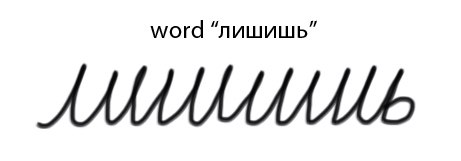
While it’s very possible he’s doodling, let us not forget that Russian Cursive apparently looks like this:
So it is very possible he just has messy handwriting (look at how he’s holding the pen) and is in fact taking notes.
Or he could just be doodling.
I’ve never seen Russian cursive and now I can’t stop laughing.
This kind of thing is why cursive is a horrible idea.
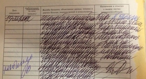
Russian doctors notes written in cursive. Pretty sure Putin is actually taking notes.
My eyes….
@lilietsblog are you for real right now is this actually a thing
Putin is 100% just scribbling, there is no sequence of letters that could look like remotely like that, no matter how bad the handwriting.
The doctors’ handwriting thing is legit tho. It’s a meme in its own right, and it pretty much takes a doctor to read a doctor’s note. If you have a doctor writing you a prescription, you are way better off asking them to dictate to you and writing it down yourself. Altho you can usually just give the note over in the pharmacy, they also have advanced doctor’s note-deciphering skills…
But nah, Putin was 100% just scribbling. Illegible Russian handwriting looks like a fence/zigzag, not a spiral.
(and btw we don’t call it cursive unless it’s a computer font or italics, we just call it ‘handwriting’ because unlike English it’s not unusable bullshit, it actually does let us write faster with minimum loss of legibility… unless your handwriting just sucks)
PS also fyi that example by socialjust-ish is legit but not actually good handwriting, you are supposed to leave gaps between letters wider than gaps within leters. it CAN look like that written by like, a third grader, but it SHOULD look more like this
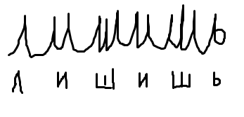
(print letters below for comparison) (excuse my messy mspaint trackpad handwriting) (also most words include letters that look differently, “лишишь” is an extreme case)
oh and just for additional cool trick
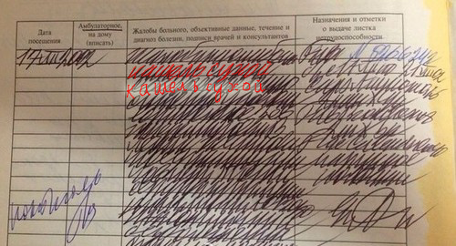
i highlighted the one line i could actualy read relatively quickly
it says “кашель сухой” – dry cough (technically, cough dry, but that’s just coz word order in russian is less fixed, it means dry cough)
so… it’s possible
the real fault of this handwriting is that the letters are too big and lines blend into one another WHO THE HELL WRITES LIKE THAT (tired underpaid doctors, that’s who)
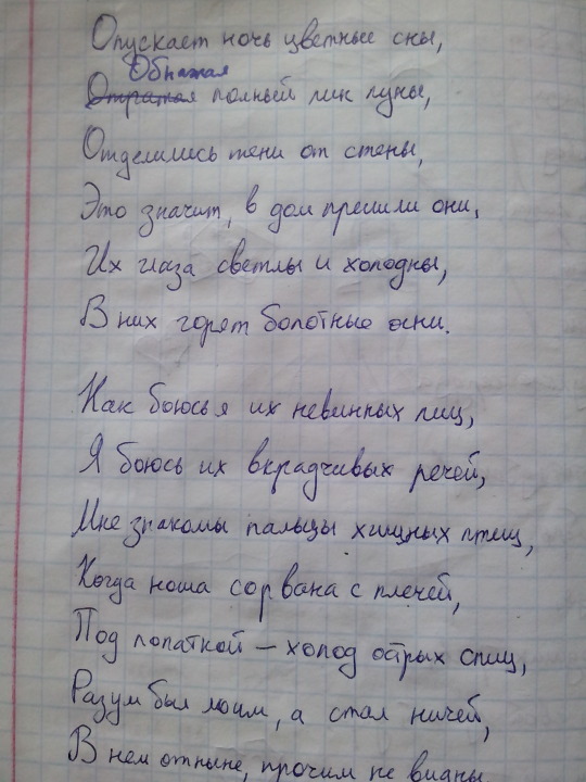
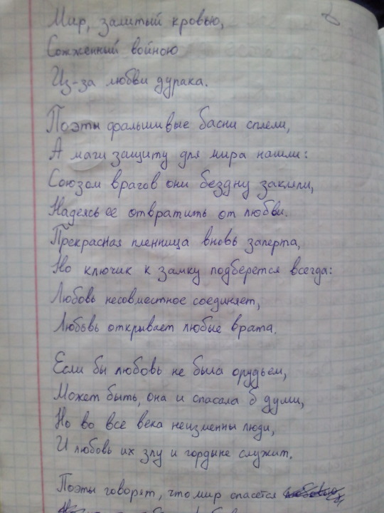
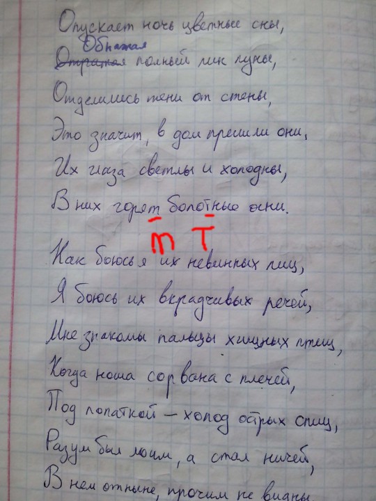
BONUS bonus: a couple of pages from my actual old notebook with some song lyrics
^ not v good handwriting, what one would call messy, but legible (and 100% cursive, non print) (i sometimes write partly with print letters but i picked a page where it was only curisve)
v legit pretty handwriting… not PERFECT but this is my personal notebook not anything official so i guess as good as it gets
Actually English Cursive was what people used almost exclusively for a long ass time and it’s a lot faster if you do it right apparently, plus I guess if you’re using ink it probably drips if you lift your pen?
Anyway the point is cursive is only useless because people stopped using it because it stopped being important to save ink or something? Plus print is more eligible for young children I guess so they teach it first
My dad had me write only in cursive for all of my projects for a straight year, which happened to be the same year I had a science class that had us do heavy outlining of our textbooks.
My print handwriting was actually immensely improved from that, and I can write a lot faster, as you might be able to imagine.
Your handwriting doesn’t really strike me as cursive at all tbh, because I associate cursive with connecting every letter in a word completely and without fail, but I think it’s very pretty. C:
Thanks! ^^
Yeah, technically we were taught that too, but I don’t write like that because that’s what ends up illegible >_> unless I’m really in a hurry and haven’t handwritten in a while, in which case I do return to early school-drilled habits instead of my later developed own
also I just realized that I lied, the first image IS a mixture of print and cursive, even if there’s just a bit of it
those are both the letter ‘t’, it’s one that has probably the bigest difference between print and cursive and i confuse it mercilessly
We don’t exactly use dripping ink pens either, but we still use cursive because even if you don’t connect every single letter it’s still more fluid and therefore faster.
I generally have, like, four modes for my handwriting:
1) super fast / without practice: barely legible cursive
2) having settled in, at a normal pace: mixture of print and cursive (as you can see above)
3) seriously not hurrying anywhere, just trying to make it pretty: the unconnected cursive that you can see further above; note how I actually connect more when I’m in a hurry
4) filling in legal forms that demand every letter be separate: actually a mixture of print and cursive again, unless I pay special attention to make it print-only
from what I’ve been able to gather from the occasions when I come into contact with other people’s handwriting, that’s a pretty common distribution
P.S. no i did not notice the lack of connection between letters in my ‘pretty’ handwriting until you pointed it out, nobody ever got hung up on it since midle school which was like 10 years ago, it’s a neat detail i only consciously thought about now. it’s 100% the legibility thing, and writing out every letter separately makes them individually prettier too